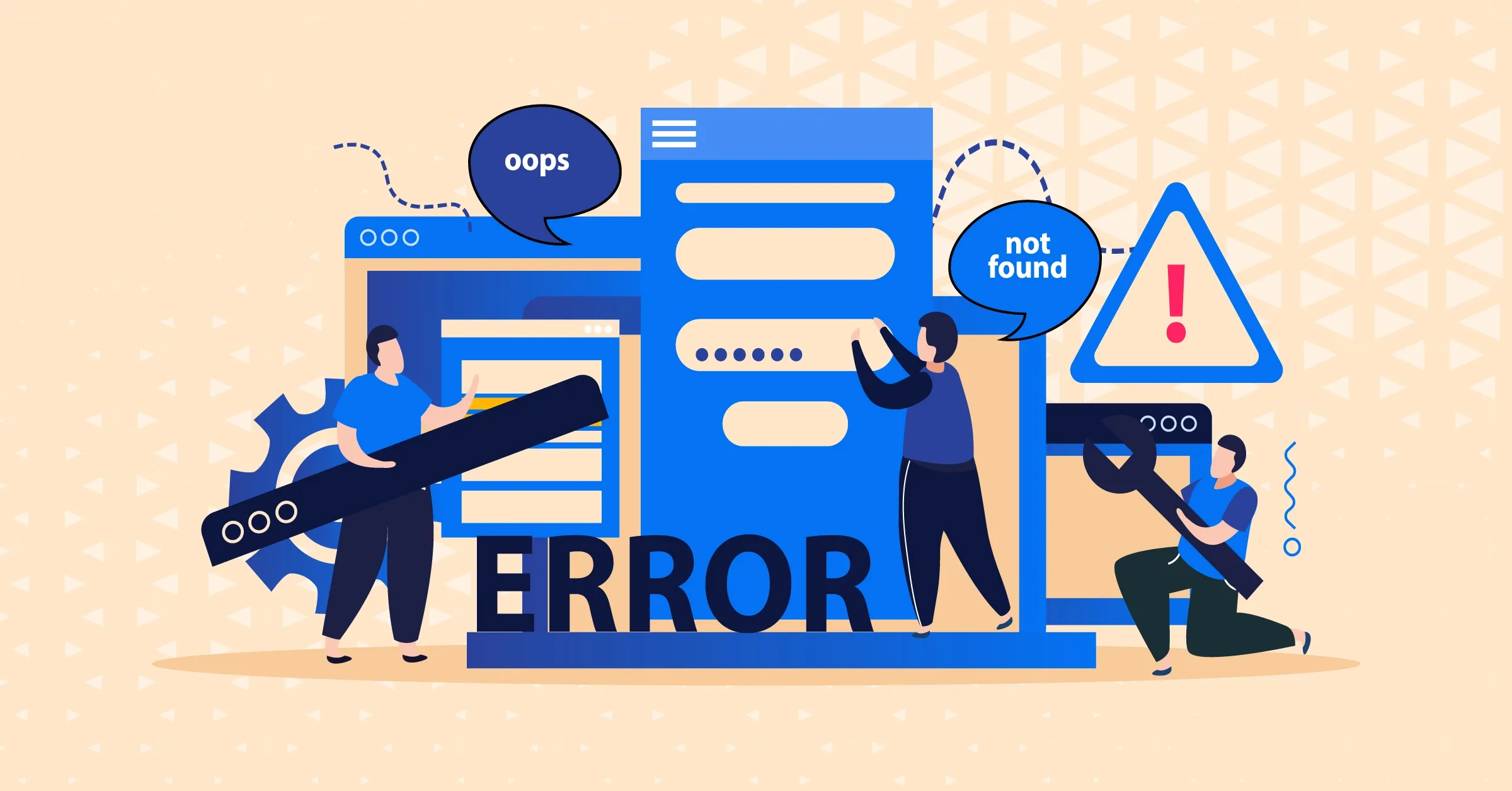
Web Design Mistakes to Avoid: Creating User-Friendly Websites
Good web design is essential for a great website. Avoid clutter and loud colors, and make sure it loads fast. Easy navigation and mobile responsiveness are vital. Use pop-up ads sparingly. Create engaging call-to-action buttons. Use balanced layouts, complementary colors, and excellent graphics for a captivating website. This enhances the user experience, boosts brand perception, and increases conversion rates for a successful online presence.
Overview
The last thing you want as a developing brand is to make web design mistakes when establishing an online presence. Even the most experienced designers can make common mistakes in website design in this digital world that might harm the success of their websites.
Above all, mistakes in web design can block a positive user experience like potholes do on the information road. Therefore, avoid these mistakes if you want to attract more and more visitors.
Let's delve into the enticing subject of web design mistakes and how to avoid them. We'll take these problems one at a time, whether it's cluttering layouts that confuse visitors or flashy animations that prolong loading times.
More importantly, you'll be well-equipped to develop websites that are not just visually appealing but also simple to use and intuitive if you are aware of these mistakes and avoid them. Consequently, let's start and learn how to create outstanding web designs that leave a lasting impact on users everywhere.
What is Web design?
Let's start by discussing what web design means. The overall look and feel of a website is created through web design. Most consumers base their opinion of a brand on its website. Throughout the user's journey, it affects how they feel.
Additionally, Images, textual content, colors, fonts, different buttons, forms, icons, and the overall layout itself are visual components of web design, and neglecting them and making these web design mistakes hurt SEO.
How does web design affect businesses?
A well-designed website raises brand awareness, and any website design mistakes can take that away too. A happy user will tell their friends about the website or even post the link on social media. Unquestionably, effective site design is one of the essential components for quickly drawing in a large audience, so try to avoid any landing page design mistakes using landing page agencies.
Furthermore, It represents a rise in conversion. The owner does not find a regular visit to the site interesting, and all business owners desire user action. Also, the likelihood that a visitor will want to register or make a purchase will be substantially higher if they enjoy the interface and can navigate the site easily. Despite this, visitors occasionally won't act in this manner right away. Moreover, the user will still come back to you after a few days.
Common Web Design Mistakes
Do you know what sets a professional designer apart from others? Pay close attention to the details. A nice and tidy design conveys quality and makes users feel good. Thus, it affects upcoming sales. Even so, seemingly unimportant details can make a difference. Therefore, look at the common web design mistakes that designers should avoid to create an appealing website.
1. Clustered Website Design, Colors, Images, And Fonts
Most first impressions of websites are based on their design. Too many colors, varied fonts, and poor-quality photos create a crowded web design that, without a doubt, forces users to leave the page as soon as possible since it is unappealing to the eye.
Here is what you can do:
- Instead of utilizing only one or two basic colors, think about using complementary hues to build a website and brand that appeal to your audience
- By providing a balanced and well-dispersed layout, you can keep your design enjoyable
- Avoid using too many different font sizes and styles and limit yourself to just a handful
- Use grids to organize your website and make clean sections
- Pay attention to the typeface you employ for the entire website
- Also, add unique and high-quality images and videos to your website
2. Web design that isn't responsive and loads slowly
What reactions do you get when a page loads slowly? Right, it's annoying. In contrast, the majority of people shop online on their mobile devices, and 1 in 4 visitors may stay if the website loads slowly (more than 4 seconds). Therefore, a website's design that is not optimized for all devices and screen sizes will eventually lose visitors due to its poor responsiveness.
Here is what you can do:
- Adjust the spacing for desktop and mobile devices differently
- Use fitting design features to cut out the time it takes for a page to load
- Make caching available to speed up loading for repeat visitors
- Disable any extra plugins
- Image optimization is necessary to guarantee device compatibility
- Use plugins to simplify the code, such as Better WordPress Minify
3. User Navigation Is Not Prioritized
Difficulty in finding what they are looking for on the website will probably cause visitors to leave. It is one of the most common web design mistakes.
Here's what you can do:
- Use the screen's top navigation bar, which is simple and proven
- Lessen the amount of scrolling and clicking required to make a transaction or view product information
- Create effective headings and subheadings for your website
- Design attractive landing pages with the necessary navigational features
- Ensure that sidebars are visible and easy to use
- Maintain a standardized navigational layout
4. Overuse of Pop-up Ads
Are there too many pop-ups on your screen, causing you to leave the website? The same is true of your visitors. These days, pop-ups are perceived as an obtrusive design element that might divert online marketers from the web design material they want to see and result in several web design mistakes. Therefore, If used properly, these techniques can significantly boost your Popup marketing.
Here's what you can do:
- Don’t use too many pop-ups all at once
- Only display pop-ups when they are relevant to the user
- Place pop-up advertisements in strategic places on the page
- Seamlessly blend pop-ups into the website's overall design
- Offer an easy process for users to reject the advertisement
- Make your graphic designs and colors appealing
- Steer clear of inappropriate pop-ups
5. CTAs with poor placement and design
A website that lacks a call to action (CTA) is equivalent to having no purpose. Why! Because people won't connect with your website or make purchases if there isn't a clear call to action. Additionally, it's crucial to keep in mind that failing to provide a clear CTA at the appropriate times may prevent many hot leads from being converted.
Here's what you can do:
- Place a clear and inviting CTA button on each page to guide users to the next step
- Ensure the buttons have a clickable appearance to encourage interaction
- Make the buttons stand out by leaving empty gaps around them for attention
- Position the buttons where users naturally expect to find them
- Use emotionally engaging terms in the button content
- Keep the button text brief and action-oriented
- Test different word, color, and position combinations to determine the most effective one
6. Having an unsecured website
Cyber dangers from malicious emails and phishing have significantly increased by 60% in today's dynamic digital environment. Surprisingly, almost 60% of these breaches are related to shoddy, unreliable websites. This can harm a company's brand and customers' trust in addition to having financial repercussions. Firms risk losing both their reputation and their bottom line by ignoring website security.
Here's what you can do:
- Choose a reliable web hosting service with strong security measures
- Meet the highest standards for handling credit card information securely
- Obtain certifications for information security and data protection
- Use secure communication protocols for data transmission
- Defend against cyberattacks targeting your website
- Regularly monitor website security for threats and vulnerabilities
- Implement an extra layer of security with codes or devices beyond passwords
7. Websites That Are Not Responsive
All browsers and devices should be able to access a good website with the same functionality. It can be problematic to create unique designs for numerous platforms. A non-responsive website may be more expensive to maintain, provide a poor user experience, and draw fewer visitors. To prevent these issues, it is crucial to concentrate on making it responsive. Customers will appreciate visiting your website on any device this way, and you'll get more visits and have less maintenance work to do.
Here's what you can do:
- Set responsive breakpoints for various devices, ensuring consistency
- Create a flexible fluid grid system for harmonious layout adjustments
- Design touch-friendly elements for easy interaction on touchscreens
- Opt for readable fonts and sizes for better legibility across screens
- Save time with pre-designed themes, customized to your needs
- Test on real devices to fix issues and enhance user experience
8. Ignoring the importance of the grid and the columns
Rows and columns can be used by website designers to produce a faultless user experience thanks to CSS. Numerous media query breakpoints are unnecessary thanks to features like Grid-template-columns, min-max, and autofit. However, breakpoints can still be required when utilizing grid-template areas. Designers frequently make the error of misinterpreting CSS words and numbers. Knowing these characteristics enables designers to create beautiful and responsive web layouts with ease.
Here's what you can do:
- Grid items are positioned horizontally using values before and after a slash (/)
- The value before the slash sets the starting position, while the value after the slash determines the ending position
- Each position can be "auto" or a custom name, providing flexibility in grid layout design
9. Ignoring templates for trendy website designs
People like websites with cutting-edge, SEO-friendly designs in today's digital world. But while employing current design templates, it's crucial to be aware of common pitfalls. A gap between your brand and the design can result from selecting templates that are inappropriate for your firm.
Additionally, overusing animations and effects might slow down your website and divert visitors' attention away from the primary information. It's important to strike a balance between aesthetic appeal and usability; user-friendly navigation and necessary features must not be sacrificed for an aesthetically pleasing design.
To distinguish out from the competition, personalization is crucial. Create a unique website that accurately portrays your business instead of using generic themes if you want to successfully engage and keep your audience on your site.
Here's what you can do:
- Pre-designed layouts for quick and easy website creation
- Customize pages without coding by dragging and dropping elements
- Adjust elements for a unique look and feel
- Cost-effective compared to hiring a web designer
- Mobile-responsive templates are available for a great user experience on various devices
10. Unrelated logo to the website's theme
A logo that doesn't match the layout of a company's website is among the biggest mistakes that can be made. Even though it may appear like a little problem, clients may become confused by it.
Therefore, people may quit a website if they don't trust it or if the logo and website have contrasting aesthetics because they question the legitimacy of the company. To prevent these issues, it's crucial to make sure that the logo and website design are in line.
Here's what you can do:
- Reflect the nature of the business: Make sure the logo captures the spirit of your business and the products it offers
- Consistent Font Style: Pick a font style that is the same in all of the logo's components
- Resonant Colors: Choose hues that complement the concept of your website and are appealing to your target audience
- Professional Designer: Employ a talented designer to produce a premium and distinctive logo
- Reliable Logo Design Company: Seek counsel from a reputable logo design company to gain insightful information and direction at every stage of the procedure.
Conclusion
Web design mistakes should be avoided if you want to create an online effect. Imagine a layout that is so seamless and lovely that viewers can't help but fall in love right away. We'll show you how to avoid clustering layout problems and teach you how to use color, fonts, and images effectively.
Immediately, bid adieu to pages that take a long time to load and welcome responsiveness, which enchants users on all devices.
Take advantage of the chance and avoid these web design mistakes to produce a memorable digital experience with web design SEO services. So, are you prepared to up your web design game? Join forces with Gigde(web design and SEO services) today to realize the full potential of your website!
Frequently Asked Questions (FAQ)
Q1. Why is web design significant for businesses?
Ans. Web design describes the visual elements, structure, and overall appearance and feel of a website. It has an impact on how customers view and engage with a company online. A well-designed website may improve the user experience, increase conversion rates, and promote brand visibility, making it a key element in drawing in and keeping a sizable audience.
Q2. What web design mistakes should be avoided?
Ans. Web design mistakes that are frequently made include cluttered layouts with too many colors, fonts, and low-resolution graphics. Visitors may leave if the website is not optimized for responsiveness and loads slowly. Other errors to watch out for include failing to prioritize user navigation, overusing pop-up advertisements, and placing call-to-action buttons in awkward locations.
Q3. What are the strategies to avoid web design mistakes?
Ans. To avoid web design mistakes, use complementary colors, balanced layouts, and high-quality graphics to improve site design. Reduce loading times, prioritize user-friendly navigation, and improve the website's responsiveness. Create call-to-action buttons that are crystal clear and appealing, and use pop-ups sparingly and wisely. To improve user engagement and conversion rates, test variants frequently to find the winning formula.
Related blogs:
1. Did You Check Your Website Health? A Complete Guide to Higher SERP
2. Digital Marketing for Cleaning Business; the Roadmap to Success
3. What is The Importance of Data Science For Digital Marketing?